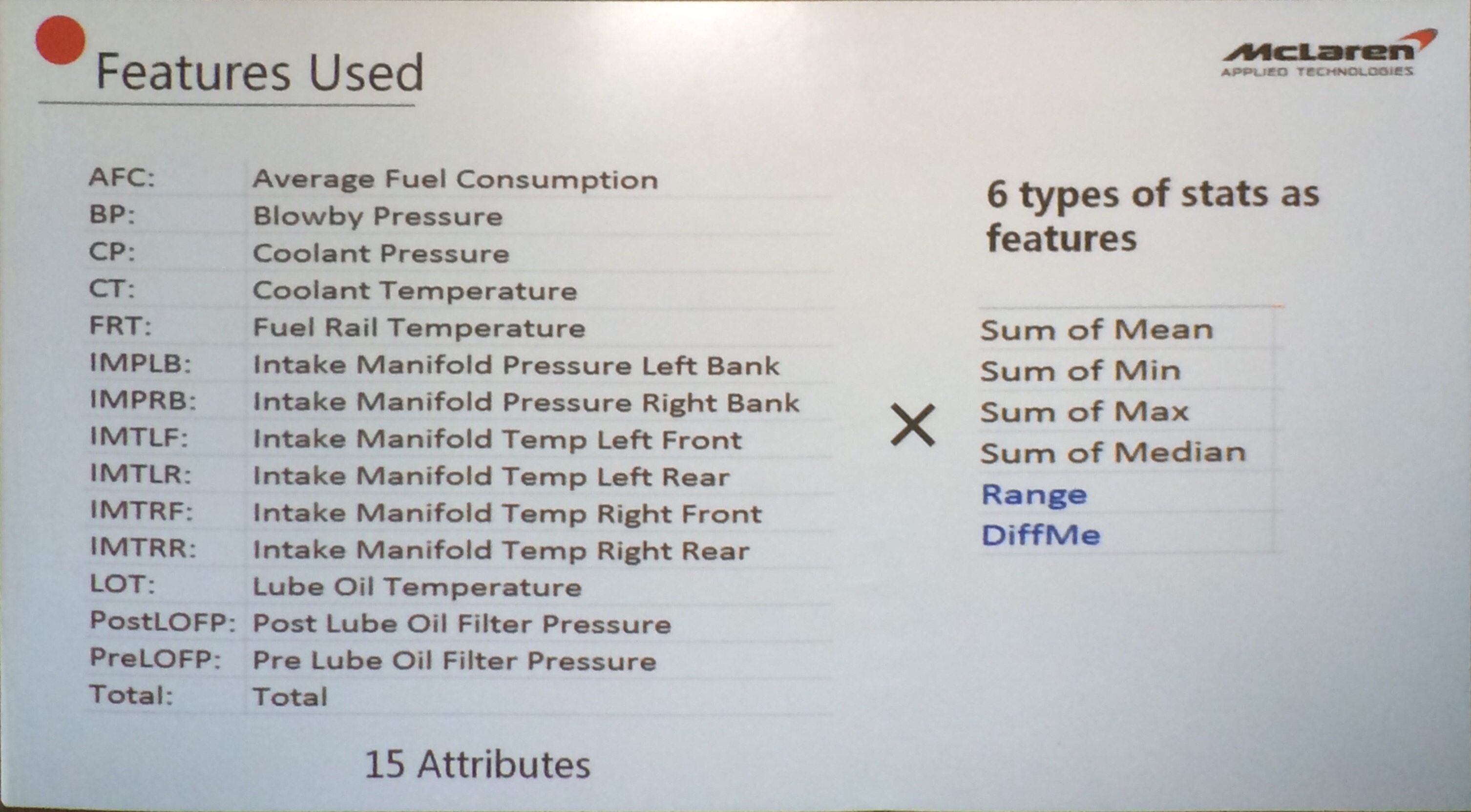
Learn the Basics of Git and Version Control

Introduction

There are four fundamental elements in the Git Workflow.
Working Directory, Staging Area, Local Repository and Remote Repository.

If you consider a file in your Working Directory, it can be in three possible states.

  1. It can be staged. Which means the files with with the updated changes are marked to be committed to the local repository but not yet committed.
  2. It can be modified. Which means the files with the updated changes are not yet stored in the local repository.
  3. It can be committed. Which means that the changes you made to your file are safely stored in the local repository.
  • git add is a command used to add a file that is in the working directory to the staging area.
  • git commit is a command used to add all files that are staged to the local repository.
  • git push is a command used to add all committed files in the local repository to the remote repository. So in the remote repository, all files and changes will be visible to anyone with access to the remote repository.
  • git fetch is a command used to get files from the remote repository to the local repository but not into the working directory.
  • git merge is a command used to get the files from the local repository into the working directory.
  • git pull is command used to get files from the remote repository directly into the working directory. It is equivalent to a git fetch and a git merge .
git --version
git config --global --list

Check your machine for existing SSH keys:

ls -al ~/.ssh

If you already have a SSH key, you can skip the next step of generating a new SSH key

Generating a new SSH key and adding it to the ssh-agent

ssh-keygen -t rsa -b 4096 -C "your_email@example.com"

When adding your SSH key to the agent, use the default macOS ssh-add command. Start the ssh-agent in the background:

Adding a new SSH key to your GitHub account

To add a new SSH key to your GitHub account, copy the SSH key to your clipboard:

pbcopy < ~/.ssh/id_rsa.pub

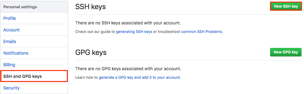
Copy the In the “Title” field, add a descriptive label for the new key. For example, if you’re using a personal Mac, you might call this key “Personal MacBook Air”.

Paste your key into the “Key” field.

After you’ve set up your SSH key and added it to your GitHub account, you can test your connection:

ssh -T git@github.com

Let’s Git

Create a new repository on GitHub. Follow this link.
Now, locate to the folder you want to place under git in your terminal.

echo "# testGit" >> README.md

Now to add the files to the git repository for commit:

git add . 
git status

Now to commit files you added to your git repo:

git commit -m "First commit"
git status

Add a remote origin and Push:

Now each time you make changes in your files and save it, it won’t be automatically updated on GitHub. All the changes we made in the file are updated in the local repository.

To add a new remote, use the git remote add command on the terminal, in the directory your repository is stored at.

The git remote add command takes two arguments:

  • A remote name, for example, origin
  • A remote URL, for example, https://github.com/user/repo.git

Now to update the changes to the master:

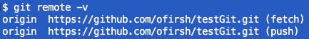
git remote add origin https://github.com/ofirsh/testGit.git
git remote -v

Now the git push command pushes the changes in your local repository up to the remote repository you specified as the origin.

git push -u origin master

And now if we go and check our https://github.com/ofirsh/testGit repository page on GitHub it should look something like this:

See the Changes you made to your file:

Once you start making changes on your files and you save them, the file won’t match the last version that was committed to git.

Let’s modify README.md to include the following text:

To see the changes you just made:

git diff

Markers for changes

--- a/README.md
+++ b/README.md

These lines are a legend that assigns symbols to each diff input source. In this case, changes from a/README.md are marked with a --- and the changes from b/README.md are marked with the +++ symbol.

Diff chunks

The remaining diff output is a list of diff ‘chunks’. A diff only displays the sections of the file that have changes. In our current example, we only have one chunk as we are working with a simple scenario. Chunks have their own granular output semantics.

Revert back to the last committed version to the Git Repo:

Now you can choose to revert back to the last committed version by entering:

git checkout .

View Commit History:

You can use the git log command to see the history of commit you made to your files:

$ git log
echo 'testGit #2' > README.md 
git add .
git commit -m 'second commit'
git push origin master

Pushing Changes to the Git Repo:

Now you can work on the files you want and commit to changes locally. If you want to push changes to that repository you either have to be added as a collaborator for the repository or you have create something known as pull request. Go and check out how to do one here and give me a pull request with your code file.

So to make sure that changes are reflected on my local copy of the repo:

git pull origin master

Two more useful command:

git fetch
git merge

In the simplest terms, git fetch followed by a git merge equals a git pull. But then why do these exist?

When you use git pull, Git tries to automatically do your work for you. It is context sensitive, so Git will merge any pulled commits into the branch you are currently working in. git pull automatically merges the commits without letting you review them first.

When you git fetch, Git gathers any commits from the target branch that do not exist in your current branch and stores them in your local repository. However, it does not merge them with your current branch. This is particularly useful if you need to keep your repository up to date, but are working on something that might break if you update your files. To integrate the commits into your master branch, you use git merge.

Pull Request

Pull requests let you tell others about changes you’ve pushed to a GitHub repository. Once a pull request is sent, interested parties can review the set of changes, discuss potential modifications, and even push follow-up commits if necessary.

null

Pull requests are GitHub’s way of modeling that you’ve made commits to a copy of a repository, and you’d like to have them incorporated in someone else’s copy. Usually the way this works is like so:

  1. Lady Ada publishes a repository of code to GitHub.
  2. Brennen uses Lady Ada’s repo, and decides to fix a bug or add a feature.
  3. Brennen forks the repo, which means copying it to his GitHub account, and clones that fork to his computer.
  4. Brennen changes his copy of the repo, makes commits, and pushes them up to GitHub.
  5. Brennen submits a pull request to the original repo, which includes a human-readable description of the changes.
  6. Lady Ada decides whether or not to merge the changes into her copy.

Creating a Pull Request

There are 2 main work flows when dealing with pull requests:

  1. Pull Request from a forked repository
  2. Pull Request from a branch within a repository

Here we are going to focus on 2.

Creating a Topical Branch

First, we will need to create a branch from the latest commit on master. Make sure your repository is up to date first using

git pull origin master

To create a branch, use git checkout -b <new-branch-name> [<base-branch-name>], where base-branch-name is optional and defaults to master. I’m going to create a new branch called pull-request-demo from the master branch and push it to github.

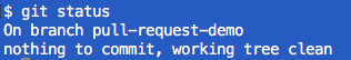
git checkout -b pull-request-demo
git status
git push origin pull-request-demo

Now you can see two branches:

and

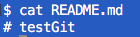
make some changes to README.md:

echo "test git #3 pull-request-demo" >> README.md
cat README.md
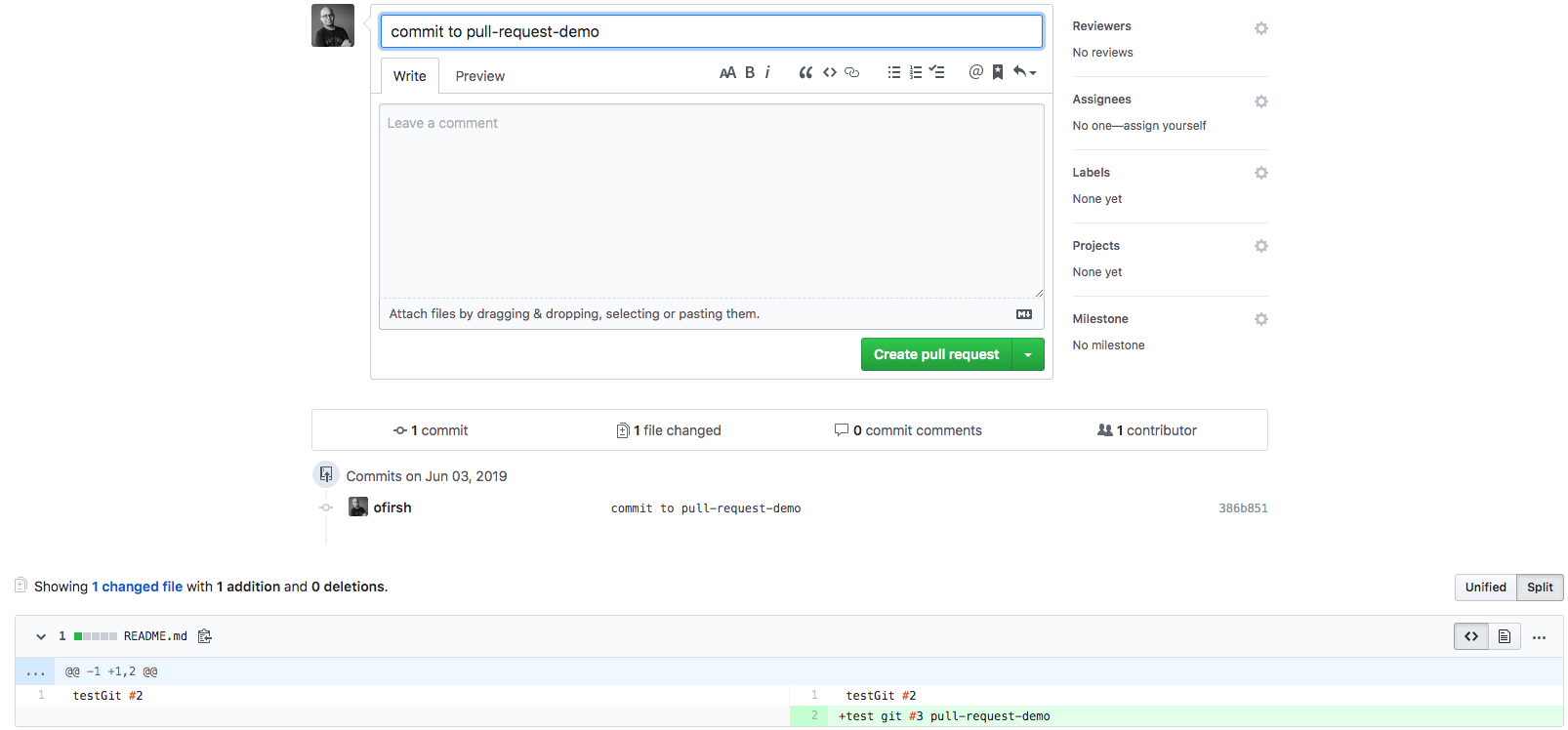
Commit the changes:

git add README.md
git commit -m 'commit to pull-request-demo'

…and push your new commit back up to your copy of the repo on GitHub:

git push --set-upstream origin pull-request-demo

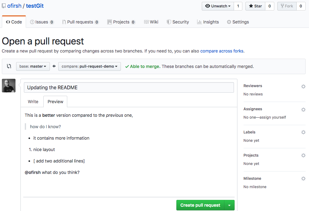
Back to the web interface:

You can press the “Compare”, and now you can create the pull request:

Go ahead and click the big green “Create Pull Request” button. You’ll get a form with space for a title and longer description:

Like most text inputs on GitHub, the description can be written in GitHub Flavored Markdown. Fill it out with a description of your changes. If you especially want a user’s attention in the pull request, you can use the “@username” syntax to mention them (just like on Twitter).

GitHub has a handy guide to writing the perfect pull request that you may want to read before submitting work to other repositories, but for now a description like the one I wrote should be ok. You can see my example pull request here.

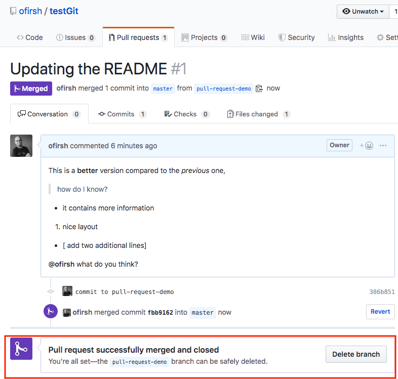
Pressing the green “Create pull request”:

And now, pressing the “Merge pull request” button:

Confirm merge:

Switching you local repo back to master:

git checkout master
git pull origin master

And now the local repo is pointing to master and contains the merged files.

Enjoy!

BTW please find below a nice Git cheat sheet

References:

Learn the Basics of Git in Under 10 Minutes

Pull Request Tutorial

Submitting a Pull Request on GitHub

Recall, Precision, F1, ROC, AUC, and everything

Your boss asked you to build a fraud detection classifier, so you’ve created one.

The output of your fraud detection model is the probability [0.0-1.0] that a transaction is fraudulent. If this probability is below 0.5, you classify the transaction as non-fraudulent; otherwise, you classify the transaction as fraudulent.

To evaluate the performance of your model, you collect 10,000 manually classified transactions, with 300 fraudulent transaction and 9,700 non-fraudulent transactions. You run your classifier on every transaction, predict the class label (fraudulent or non-fraudulent) and summarise the results in the following confusion matrix:

A True Positive (TP=100) is an outcome where the model correctly predicts the positive (fraudulent) class. Similarly, a True Negative (TN=9,000) is an outcome where the model correctly predicts the negative (non-fraudulent) class.

False Positive (FP=700) is an outcome where the model incorrectly predicts the positive  (fraudulent) class. And a False Negative (FN=200) is an outcome where the model incorrectly predicts the negative (non-fraudulent) class.

Asking yourself what percent of your predictions were correct, you calculate the accuracy:

Accuracy = \frac{True}{True+False} = \frac{TP+TN}{TP+TN+FP+FN} = \frac{100+9,000}{100+9,000+700+200} = \frac{9,100}{10,000} = 0.91

Wow, 91% accuracy! Just before sharing the great news with your boss, you notice that out of the 300 fraudulent transactions, only 100 fraudulent transactions are classified correctly. Your classifier missed 200 out of the 300 fraudulent transactions!

Your colleague, hardly hiding her simile, suggests a “better” classifier. Her classifier predicts every transaction as non-fraudulent (negative), with a staggering 97% accuracy!

Accuracy =   \frac{True}{True+False} = \frac{TP+TN}{TP+TN+FP+FN} = \frac{0+9,700}{100+9,000+700+200} = \frac{9,700}{10,000} = 0.97

While 97% accuracy may seem excellent at first glance, you’ve soon realized the catch: your boss asked you to build a fraud detection classifier, and with the always-return-non-fraudulent classifier you will miss all the fraudulent transactions.

“Nothing travels faster than the speed of light, with the possible exception of bad news, which obeys its own special laws.” 

Douglas Adams

You learned the hard-way that accuracy can be misleading and that for problems like this, additional measures are required to evaluate your classifier.

You start by asking yourself what percent of the positive (fraudulent) cases did you catch? You go back to the confusion matrix and divide the True Positive (TP – blue oval) by the overall number of true fraudulent transactions (red rectangle)

Recall ( True Positive Rate ) = \frac{TP}{TP+FN} = \frac{100}{100+200} \approx 0.333

So the classier caught 33.3% of the fraudulent transactions.

Next, you ask yourself what percent of positive (fraudulent) predictions were correct? You go back to the confusion matrix and divide the True Positive (TP – blue oval) by the overall number of predicted fraudulent transactions (red rectangle)

Precision =   \frac{TP}{TP+FP} = \frac{100}{100+700} = 0.125

So now you know that when your classifier predicts that a transaction is fraudulent, only 12.5% of the time your classifier is correct.

F1 Score combines Recall and Precision to one performance metric. F1 Score is the weighted average of Precision and Recall. Therefore, this score takes both false positives and false negatives into account. F1 is usually more useful than Accuracy, especially if you have an uneven class distribution.

F1 = 2*\frac{Recall * Precision}{ Recall + Precision}=2*\frac{0.333 * 0.125}{ 0.333 + 0.125}\approx 0.182

Finally, you ask yourself what percent of negative (non-fraudulent) predictions were incorrect? You go back to the confusion matrix and divide the False Positive (FP – blue oval) by the overall number of true non-fraudulent transactions (red rectangle)

False Positive Rate = \frac{FP}{FP+TN} = \frac{700}{700+9,000} \approx 0.072

7.2% of the non-fraudulent transactions were classified incorrectly as fraudulent transactions.

ROC (Receiver Operating Characteristics)

You soon learn that you must examine both Precision and Recall. Unfortunately, Precision and Recall are often in tension. That is, improving Precision typically reduces Recall and vice versa.

The overall performance of a classifier, summarized over all possible thresholds, is given by the Receiver Operating Characteristics (ROC) curve. The name “ROC” is historical and comes from communications theory. ROC Curves are used to see how well your classifier can separate positive and negative examples and to identify the best threshold for separating them.

To be able to use the ROC curve, your classifier should be able to rank examples such that the ones with higher rank are more likely to be positive (fraudulent). As an example, Logistic Regression outputs probabilities, which is a score that you can use for ranking.

You train a new model and you use it to predict the outcome of 10 new test transactions, summarizing the result in the following table: the values of the middle column (True Label) are either zero (0) for non-fraudulent transactions or one (1) for fraudulent transactions, and the last column (Fraudulent Prob) is the probability that the transaction is fraudulent:

Remember the 0.5 threshold? If you are concerned about missing the two fraudulent transactions (red circles), then you may consider lowering this threshold.

For instance, you might lower the threshold and label any transaction with a probability below 0.1 to the non-fraudulent class, catching the two fraudulent transactions that you previously missed.

To derive the ROC curve, you calculate the True Positive Rate (TPR) and the False Positive Rate (FPR), starting by setting the threshold to 1.0, where every transaction with a Fraudulent Prob of less than 1.0 is classified as non-fraudulent (0). The column “T=1.0” shows the predicted class labels when the threshold is 1.0:

The confusion matrix for the Threshold=1.0 case:

The ROC curve is created by plotting the True Positive Pate (TPR) against the False Positive Rate (FPR) at various threshold settings, so you calculate both:

True Positive Rate (Recall) = \frac{TP}{TP+FN} = \frac{0}{0+5} =0

False Positive Rate = \frac{FP}{FP+TN} = \frac{0}{0+5} =0

You summarize it in the following table:

Now you can finally plot the first point on your ROC graph! A random guess would give a point along the dotted diagonal line (the so-called line of no-discrimination) from the left bottom to the top right corners

You now lower the threshold to 0.9, and recalculate the FPR and the TPR:

The confusion matrix for Threshold=0.9:

True Positive Rate (Recall) = \frac{TP}{TP+FN} = \frac{1}{1+4} =0.2

False Positive Rate = \frac{FP}{FP+TN} = \frac{0}{0+5} =0

Adding a new row to your summary table:

You continue and plot the True Positive Pate (TPR) against the False Positive Rate (FPR) at various threshold settings:

Receiver Operating Characteristics (ROC) curve

And voila, here is your ROC curve!

AUC (Area Under the Curve)

The model performance is determined by looking at the area under the ROC curve (or AUC). An excellent model has AUC near to the 1.0, which means it has a good measure of separability. For your model, the AUC is the combined are of the blue, green and purple rectangles, so the AUC = 0.4 x 0.6 + 0.2 x 0.8 + 0.4 x 1.0 = 0.80.

You can validate this result by calling roc_auc_score, and the result is indeed 0.80.

Conclusion

  • Accuracy will not always be the metric.
  • Precision and recall are often in tension. That is, improving precision typically reduces recall and vice versa.
  • AUC-ROC curve is one of the most commonly used metrics to evaluate the performance of machine learning algorithms.
  • ROC Curves summarize the trade-off between the true positive rate and false positive rate for a predictive model using different probability thresholds.
  • The ROC curve can be used to choose the best operating point.

Thanks for Reading! You can reach me at LinkedIn and Twitter.

References:

[1] An Introduction to Statistical Learning [James, Witten, Hastie, and Tibshirani]

The Secret Recipe Behind GO-FOOD’s Recommendations (PyData Meetup)

The December PyData Meetup started with Luis Smith, Data Scientist at GO-JEK, sharing the Secret Recipe Behind GO-FOOD’s Recommendations:

“For GO-FOOD, we believe the key to unlocking good recommendations is to derive vector representations for our users, dishes, and merchants. This way we are able to capture our users’ food preferences and recommend them the most relevant merchants and dishes.”

How do people think about the food?

  • Flavor profile
  • Trendy
  • Value for money
  • Portion size
  • Ingredients

… and much more

The preferred approach is to let the transactional data discover the pattern.

A sample ETL workflow:

Using StarSpace to learn the vector representations:

Go-Jek formulation of the problem:

User-to-dish similarity is surfaced in the app via the “dishes you might like”. The average vector of customer’s purchases represents the recommended dish.

Due to data sparsity, item-based collaborative filtering is used for merchant recommendation.

The cold start problem is still an issue, for inactive users or users that purchase infrequently.

(published here)

Highlights of the 2018 Singapore Symposium on Natural Language Processing (SSNLP)

What a great symposium! Thank you Dr. Linlin Li, Prof. Ido Dagan, Prof. Noah Smith and the rest of the speakers for the interesting talks and thank you Singapore University of Technology and Design (SUTD) for hosting this event. Here is a quick summary of the first half of the symposium, you can learn more by looking for the papers published by these research groups:

Linlin Li: The text processing engine that powers Alibaba’s business applications

Dr. Linlin Li from Alibaba presented the mission of Alibaba’s NLP group and spoke about AliNLP, a large scale NLP technology platform for the entire Alibaba Eco-system, dealing with data collection and multilingual algorithms for lexical, syntactic, semantic, discourse analysis and distributed representation of text.

Alibaba is also helping to improve the quality of the Electronic Medical Records (EMRs) in China, traditionally done by labour intensive methods.

Ido Dagan: Consolidating Textual Information

Prof. Ido Dagan gave an excellent presentation on Natural Knowledge Consolidating Textual Information. Texts come in large multitudes, such as news story, search results, and product reviews. Search interfaces hasn’t changed much in decades, which make them accessible, but hard to consume. For example, the news tweets illustration in the slide below shows that here is a lot of redundancy and complementary information, so there is a need to consolidate the knowledge within multiple texts.

Generic knowledge representation via structured knowledge graphs and semantic representation are often being used, where both approaches require an expert to annotate the dataset, which is expansive and hard to replicate.

The structure of a single sentence will look like this:

The information can be consolidated across the various data sources via Coreference

To conclude

Noah A. Smith: Syncretizing Structured and Learned Representation

Prof. Noah described new ways to use representation learning for NLP

Some promising results

Prof. Noah presented different approaches to solve backpropagation with structure in the middle, where the intermediate representation is non-differentiable.

See you all the the next conference!

MICE is Nice, but why should you care?

Multiple Imputation by Chained Equations (MICE) 

mouse-303588_1280

As every data scientist will witness, it is rarely that your data is 100% complete. We are often taught to “ignore” missing data. In practice, however, ignoring or inappropriately handling the missing data may lead to biased estimates, incorrect standard errors and incorrect inferences.

But first we need to think about what led to this missing data, or what was the mechanism by which some values were missing and some were observed?

There are three different mechanisms to describe what led to the missing values:

  • Missing Completely At Random (MCAR): the missing observations are just a random subset of all observations, so there are no systematic differences between the missing and observed data. In this case, analysis using only complete cases will not be biased, but may have lower power.
  • Missing At Random (MAR): there might be systematic differences between the missing and observed data, but these can be entirely explained by other observed variables. For example, a case where you observe gender and you see that women are more likely to respond than men. Including a lot of predictors in the imputation model can make this assumption more plausible.
  • Not Missing At Random (NMAR): the probability of a variable being missing might depend on itself on other unobserved values. For example, the probability of someone reporting their income depends on what their income is.

MICE operates under the assumption that given the variables used in the imputation procedure, the missing data are Missing At Random (MAR), which means that the probability that a value is missing depends only on observed values and not on unobserved values

Multiple imputation by chained equations (MICE) has emerged in the statistical literature as one principled method of addressing missing data. Creating multiple imputations, as opposed to single imputations, accounts for the statistical uncertainty in the imputations. In addition, the chained equations approach is very flexible and can handle variables of varying types (e.g., continuous or binary) as well as complexities such as bounds.

The chained equation process can be broken down into the following general steps:

  • Step 1: A simple imputation, such as imputing the mean, is performed for every missing value in the dataset. These mean imputations can be thought of as “place holders.”
  • Step 2: Start Step 2 with the variable with the fewest number of missing  values. The “place holder” mean imputations for one variable (“var”) are set back to missing.
  • Step 3: “var” is the dependent variable in a regression model and all the other variables are independent variables in the regression model.
  • Step 4: The missing values for “var” are then replaced with predictions (imputations) from the regression model. When “var” is subsequently used as an independent variable in the regression models for other variables, both the observed and these imputed values will be used.
  • Step 5: Moving on to the next variable with the next fewest missing values, steps 2–4 are then repeated for each variable that has missing data. The cycling through each of the variables constitutes one iteration or “cycle.” At the end of one cycle all of the missing values have been replaced with predictions from regressions that reflect the relationships observed in the data.
  • Step 6: Steps 2 through 4 are repeated for a number of cycles, with the imputations being updated at each cycle. The idea is that by the end of the cycles the distribution of the parameters governing the imputations (e.g., the coefficients in the regression models) should have converged in the sense of becoming stable.

To make the chained equation approach more concrete, imagine a simple example where we have 3 variables in our dataset: age, income, and gender, and all 3 have at least some missing values. I created this animation as a way to visualize the details of the following example, so let’s get started.

MICE Animation

The initial dataset is given below, where missing values are marked as N.A.

Step00

In step 1 of the MICE process, each variable would first be imputed using, e.g., mean imputation, temporarily setting any missing value equal to the mean observed value for that variable.

Step01

Then in the next step the imputed mean values of age would be set back to missing (N.A).

Step02

In the next step Bayesian linear regression of age predicted by income and gender would be run using all cases where age was observed.

Step03

In the next step, prediction of the missing age value would be obtained from that regression equation and imputed. At this point, age does not have any missingness.

Step04

The previous steps would then be repeated for the income variable. The originally missing values of income would be set back to missing (N.A).

Step05

A linear regression of income predicted by age and gender would be run using all cases with income observed.

Step06

Imputations (predictions) would be obtained from that regression equation for the missing income value.

Step07

Then, the previous steps would again be repeated for the variable gender. The originally missing values of gender would be set back to missing and a logistic regression of gender on age and income would be run using all cases with gender observed. Predictions from that logistic regression model would be used to impute the missing gender values.

Step08

This entire process of iterating through the three variables would be repeated until some measure of convergence, where the imputations are stable; the observed data and the final set of imputed values would then constitute one “complete” data set.

We then repeat this whole process multiple times in order to get multiple imputations.

* Let’s connect on Twitter (@ofirdi), LinkedIn or my Blog

Resources

What is the difference between missing completely at random and missing at random? Bhaskaran et al https://www.ncbi.nlm.nih.gov/pmc/articles/PMC4121561/

A Multivariate Technique for Multiply Imputing Missing Values Using a Sequence of Regression Models, E. Raghunathan et al http://www.statcan.gc.ca/pub/12-001-x/2001001/article/5857-eng.pdf

Multiple Imputation by Chained Equations: What is it and how does it work? Azur et al https://www.ncbi.nlm.nih.gov/pmc/articles/PMC3074241/

Recent Advances in missing Data Methods: Imputation and Weighting – Elizabeth Stuart https://www.youtube.com/watch?v=xnQ17bbSeEk

Introduction to Survival Analysis

Introduction

Survival analysis is generally defined as a set of methods for analysing data where the outcome variable is the time until the occurrence of an event of interest. For example, if the event of interest is heart attack, then the survival time can be the time in years until a person develops a heart attack. For simplicity, we will adopt the terminology of survival analysis, referring to the event of interest as ‘death’ and to the waiting time as ‘survival’ time, but this technique has much wider applicability. The event can be death, occurrence of a disease, marriage, divorce, etc. The time to event or survival time can be measured in days, weeks, years, etc.

The specific difficulties relating to survival analysis arise largely from the fact that only some individuals have experienced the event and, subsequently, survival times will be unknown for a subset of the study group. This phenomenon is called censoring.

In longitudinal studies exact survival time is only known for those individuals who show the event of interest during the follow-up period. For others (those who are disease free at the end of the observation period or those that were lost) all we can say is that they did not show the event of interest during the follow-up period. These individuals are called censored observations. An attractive feature of survival analysis is that we are able to include the data contributed by censored observations right up until they are removed from the risk set.

Survival and Hazard

T  –  a non-negative random variable representing the waiting time until the occurrence of an event.

The survival function, S(t), of an individual is the probability that they survive until at least time t, where t is a time of interest and T is the time of event.

F001

The survival curve is non-increasing (the event may not reoccur for an individual) and is limited within [0,1].

survival-graph-crop

F(t) – the probability that the event has occurred by duration t:

F002

the probability density function (p.d.f.) f(t):

F003

An alternative characterisation of the distribution of T is given by the hazard function, or instantaneous rate of occurrence of the event, defined as

F004

The numerator of this expression is the conditional probability that the event will occur in the interval [t,t+dt] given that it has not occurred before, and the denominator is the width of the interval. Dividing one by the other we obtain a rate of event occurrence per unit of time. Taking the limit as the width of the interval goes down to zero, we obtain an instantaneous rate of occurrence.

Applying Bayes’ Rule

F005

on the numerator of the hazard function:

F006

Given that the event happened between time t to t+dt, the conditional probability of this event happening after time t is 1:

F007

Dividing by dt and passing to the limit gives the useful result:

F008

In words, the rate of occurrence of the event at duration t equals the density of events at t, divided by the probability of surviving to that duration without experiencing the event.

We will soon show that there is a one-to-one relation between the hazard and the survival function.

The derivative of S(t) is:

F009

We will now show that the hazard function is the derivative of -log S(t):

F010

If we now integrate from 0 to time t:

F011

F012

F013

 and introduce the boundary condition S(0) = 1 (since the event is sure not to have occurred by duration 0):

F014

F015

we can solve the above expression to obtain a formula for the probability of surviving to duration t as a function of the hazard at all durations up to t:

F016

One approach to estimating the survival probabilities is to assume that the hazard function follow a specific mathematical distribution. Models with increasing hazard rates may arise when there is natural aging or wear. Decreasing hazard functions are much less common but find occasional use when there is a very early likelihood of failure, such as in certain types of electronic devices or in patients experiencing certain types of transplants. Most often, a bathtub-shaped hazard is appropriate in populations followed from birth.

The figure below hows the relationship between four parametrically specified hazards and the corresponding survival probabilities. It illustrates (a) a constant hazard rate over time (e.g. healthy persons) which is analogous to an exponential distribution of survival times, (b) strictly increasing (c) decreasing hazard rates based on a Weibull model, and (d) a combination of decreasing and increasing hazard rates using a log-Normal model. These curves are illustrative examples and other shapes are possible.

different_hazard_functions

Example

The simplest possible survival distribution is obtained by assuming a constant risk over time:

survival-constant-risk

Censoring and truncation

One of the distinguishing feature of the field of survival analysis is censoring: observations are called censored when the information about their survival time is incomplete; the most commonly encountered form is right censoring.

censor_truncation

Right censoring occurs when a subject leaves the study before an event occurs, or the study ends before the event has occurred. For example, we consider patients in a clinical trial to study the effect of treatments on stroke occurrence. The study ends after 5 years. Those patients who have had no strokes by the end of the year are censored. Another example of right censoring is when a person drops out of the study before the end of the study observation time and did not experience the event. This person’s survival time is said to be censored, since we know that the event of interest did not happen while this person was under observation.

Left censoring is when the event of interest has already occurred before enrolment. This is very rarely encountered.

In a truncated sample, we do not even “pick up” observations that lie outside a certain range.

Unlike ordinary regression models, survival methods correctly incorporate information from both censored and uncensored observations in estimating important model parameters

Non-parametric Models

The very simplest survival models are really just tables of event counts: non-parametric, easily computed and a good place to begin modelling to check assumptions, data quality and end-user requirements etc. When no event times are censored, a non-parametric estimator of S(t) is 1 − F(t), where F(t) is the empirical cumulative distribution function.

Kaplan–Meier

When some observations are censored, we can estimate S(t) using the Kaplan-Meier product-limit estimator. An important advantage of the Kaplan–Meier curve is that the method can take into account some types of censored data, particularly right-censoring, which occurs if a patient withdraws from a study, is lost to follow-up, or is alive without event occurrence at last follow-up.

Suppose that 100 subjects of a certain type were tracked over a period of time to determine how many survived for one year, two years, three years, and so forth. If all the subjects remained accessible throughout the entire length of the study, the estimation of year-by-year survival probabilities for subjects of this type in general would be an easy matter. The survival of 87 subjects at the end of the first year would give a one-year survival probability estimate of 87/100=0.87; the survival of 76 subjects at the end of the second year would yield a two-year estimate of 76/100=0.76; and so forth.

But in real-life longitudinal research it rarely works out this neatly. Typically there are subjects lost along the way (censored) for reasons unrelated to the focus of the study.

Suppose that 100 subjects of a certain type were tracked over a period of two years determine how many survived for one year and for two years. Of the 100 subjects who are “at risk” at the beginning of the study, 3 become unavailable (censored) during the first year and 3 are known to have died by the end of the first year. Another 2 become unavailable during the second year and another 10 are known to have died by the end of the second year.

KM_experiment_table_died

Kaplan and Meier proposed that subjects who become unavailable during a given time period be counted among those who survive through the end of that period, but then deleted from the number who are at risk for the next time period.

The table below shows how these conventions would work out for the present example. Of the 100 subjects who are at risk at the beginning of the study, 3 become unavailable during the first year and 3 die. The number surviving the first year (Year 1) is therefore 100 (at risk) – 3 (died) = 97 and the number at risk at the beginning of the second year (Year 2) is 100 (at risk) – 3 (died) – 3 (unavailable) = 94. Another 2 subjects become unavailable during the second year and another 10 die. So the number surviving Year 2 is 94 (at risk) – 10 (died) = 84.

KM_experiment_table_survived

As illustrated in the next table, the Kaplan-Meier procedure then calculates the survival probability estimate for each of the t time periods, except the first, as a compound conditional probability.

KM_experiment_table

The estimate for surviving through Year 1 is simply 97/100=0.97. And if one does survive through Year 1, the conditional probability of then surviving through Year 2 is 84/94=0.8936. The estimated probability of surviving through both Year 1 and Year 2 is therefore (97/100) x (84/94)=0.8668.

Incorporating covariates: proportional hazards models

Up to now we have not had information for each individual other than the survival time and censoring status ie. we have not considered information such as the weight, age, or smoking status of individuals, for example. These are referred to as covariates or explanatory variables.

Cox Proportional Hazards Modelling

The most interesting survival-analysis research examines the relationship between survival — typically in the form of the hazard function — and one or more explanatory variables (or covariates).

F017

where λ0(t) is the non-parametric baseline hazard function and βx is a linear parametric model using features of the individuals, transformed by an exponential function. The baseline hazard function λ0(t) does not need to be specified for the Cox model, making it semi-parametric. The baseline hazard function is appropriately named because it describes the risk at a certain time when x = 0, which is when the features are not incorporated. The hazard function describes the relationship between the baseline hazard and features of a specific sample to quantify the hazard or risk at a certain time.

The model only needs to satisfy the proportional hazard assumption, which is that the hazard of one sample is proportional to the hazard of another sample. Two samples xi and xj satisfy this assumption when the ratio is not dependent on time as shown below:

F018

The parameters can be estimated by maximizing the partial likelihood.


Sources:
https://www.cscu.cornell.edu/news/statnews/stnews78.pdf
https://www.nature.com/articles/6601118#t2
http://blog.applied.ai/survival-analysis-part1/#fn:3
http://data.princeton.edu/wws509/notes/c7s1.html
https://en.wikipedia.org/wiki/Kaplan%E2%80%93Meier_estimator
http://www.stats.ox.ac.uk/~mlunn/lecturenotes1.pdf
Kaplan-Meier methods and Parametric Regression methods, Kristin Sainani Ph.D.
http://vassarstats.net/survival.html
http://www.mas.ncl.ac.uk/~nmf16/teaching/mas3311/week09.pdf

Changing the Game with Data and Insights – Data Science Singapore

Another great Data Science Singapore (DSSG) event! Hong Cao from McLaren Applied Technologies shared his insights on applications of data science at McLaren.

The first project is using economic sensors for continuous human conditions monitoring, including sleep quality, gait and activities, perceived stress and cognitive performance.

DataScience

Gait outlier analysis provides unique insight on fatigue levels while exercising, probability of injury and post surgery performance and recovery.

Gait Analysis Data Science

DataScience(1)DataScience(3)

A related study looks into how biotelemetry assist in patient treatment such as ALS (Amyotrophic Lateral Sclerosis) disease progression monitoring. The prototype tools collect heart rate, activity and speech data to analyse disease progression.

DataScience(3)

HRV (Heart Rate Variability) features are extracted from both the time and from the frequency domains.

DataScience(4)

Activity score is derived from the three-axis accelerometer data.

DataScience(5)DataScience(6)

The second project was a predictive failure POC, to help determine the condition of Haul Trucks in order to predict when a failure might happen. The cost of having an excavator go down in the field is $5 million a day, while the cost of losing a haul truck is $1.8 million per day. If you can prevent it from going down in the field, that makes a huge difference

DataScience(7)DataScience(8)DataScience(9)DataScience(10)DataScience(11)DataScience(12)

How To Find The Lag That Results In Maximum Cross-Correlation [R]

I have two time series and I want to find the lag that results in maximum correlation between the two time series. The basic problem we’re considering is the description and modeling of the relationship between these two time series.

In signal processing, cross-correlation is a measure of similarity of two series as a function of the lag of one relative to the other. This is also known as a sliding dot product or sliding inner-product.

For discrete functions, the cross-correlation is defined as:

corr

In the relationship between two time series (yt and xt), the series yt may be related to past lags of the x-series.  The sample cross correlation function (CCF) is helpful for identifying lags of the x-variable that might be useful predictors of yt.

In R, the sample CCF is defined as the set of sample correlations between xt+h and yt for h = 0, ±1, ±2, ±3, and so on.

A negative value for h is a correlation between the x-variable at a time before t and the y-variable at time t.   For instance, consider h = −2.  The CCF value would give the correlation between xt-2 and yt.

For example, let’s start with the first series, y1:

x <- seq(0,2*pi,pi/100)
length(x)
# [1] 201

y1 <- sin(x)
plot(x,y1,type="l", col = "green")

ser1

Adding series y2, with a shift of pi/2:

y2 <- sin(x+pi/2)
lines(x,y2,type="l",col="red")

ser2

Applying the cross correlation function (cff)

cv <- ccf(x = y1, y = y2, lag.max = 100, type = c("correlation"),plot = TRUE)

corr

The maximal correlation is calculated at a positive shift of the y1 series:

cor = cv$acf[,,1]
lag = cv$lag[,,1]
res = data.frame(cor,lag)
res_max = res[which.max(res$cor),]$lag
res_max
# [1] 44

Which means that maximal correlation between series y1 and series y2 is calculated between y1t+44 and y2t

corr-2


Data Scientists, With Great Power Comes Great Responsibility

It is a good time to be a data scientist.

With great power comes great responsibilityIn 2012 the Harvard Business Review hailed the role of data scientist “The sexiest job of the 21st century”. Data scientists are working at both start-ups and well-established companies like Twitter, Facebook, LinkedIn and Google receiving a total average salary of $98k ($144k for US respondents only) .

Data – and the insights it provides – gives the business the upper hand to better understand the clients, prospects and the overall operation. Till recently, it was not uncommon for million- and -billion- dollar deals to be accepted or rejected based on the intuition & instinct. Data scientists add value to the business by leading to informed and timely decision-making process using quantifiable, data driven evidence and by translating the data into actionable insights.

So you have a rewarding corporate day job, how about doing data science for social good?

You have been endowed with tremendous data science and leadership powers and the world needs them! Mission-driven organizations are tackling huge social issues like poverty, global warming and public health. Many have tons of unexplored data that could help them make a bigger impact, but don’t have the time or skills to leverage it. Data science has the power to move the needle on critical issues but organizations need access to data superheroes like you to use it

DataKind Blog 

There are a few of programs that exist specifically to facilitate this, the United Nations #VisualizeChange challenge is the one I’ve just taken.

As the Chief Information Technology Officer, I invite the global community of data scientists to partner with the United Nations in our mandate to harness the power of data analytics and visualization to uncover new knowledge about UN related topics such as human rights, environmental issues, and political affairs.

Ms. Atefeh Riazi – Chief Information Technology Officer at United Nations

The United Nations UNITE IDEAS published a number of data visualization challenges. For the latest challenge, #VisualizeChange: A World Humanitarian Summit Data Challenge , we were provided with unstructured information from nearly 500 documents that the consultation process has generated as per July 2015. The qualitative data is categorized in emerging themes and sub-themes that have been identified according to a developed taxonomy. The challenge was to process the consultation data in order to develop an original and thought provoking illustration of information collected through the consultation process.

Over the weekend I’ve built an interactive visualization using open-source tools (R and Shiny) to help and identify innovative ideas and innovative technologies in humanitarian action, especially on communication and IT technology. By making it to the top 10 finalists, the solution is showcased here, as well as on the Unite Ideas platform and other related events worldwide, so I hope that this visualization will be used to uncover new knowledge.

#VisualizeChange Top 10 Visualizations

Opening these challenges to the public helps raising awareness – during the process of analysing the data and designing the visualization I’ve learned on some of most pressing humanitarian needs such as Damage and Need Assessment, Communication, Online Payment and more and on the most promising technologies such as Mobile, Data Analytics, Social Media, Crowdsourcing and more.

#VisualizeChange Innovative Ideas and Technologies

Kaggle is another great platform where you can apply your data science skills for social good. How about applying image classification algorithms to automate the right whale recognition process using a dataset of aerial photographs of individual whale? With fewer than 500 North Atlantic right whales left in the world’s oceans, knowing the health and status of each whale is integral to the efforts of researchers working to protect the species from extinction.

Right Whale Recognition

There are other excellent programs.

The DSSG program ran by the University of Chicago, where aspiring data scientists take on real-world problems in education, health, energy, transportation, economic development, international development and work for three months on data mining, machine learning, big data, and data science projects with social impact.

DataKind bring together top data scientists with leading social change organizations to collaborate on cutting-edge analytics and advanced algorithms to maximize social impact.

Bayes Impact  is a group of practical idealists who believe that applied properly, data can be used to solve the world’s biggest problems.

Are you aware of any other organizations and platforms doing data science for social good? Feel free to share.

Tools & Technologies

R for analysis & visualization
Shiny.io for hosting the interactive R script
The complete source code and the data is hosted here


The Evolving Role of the Chief Data Officer

In recent years, there has been a significant rise in the appointments of Chief Data Officers (CDOs).

Although this role is still very new, Gartner predicts that 25 percent of organizations will have a CDO by 2017, with that figure rising to 50 percent in heavily regulated industries such as banking and insurance. Underlying this change is an increasing recognition of the value of data as an asset.

Last week the CDOForum held an event chaired by Dr. Shonali Krishnaswamy Head Data Analytics Department I2R, evaluating the role of the Chief Data Officer and looking into data monetization strategies and real-life Big Data case studies.

According to Debra Logan, Vice President and Gartner Fellow, the

Chief Data Officer (CDO) is a senior executive who bears responsibility for the firm’s enterprise wide data and information strategy, governance, control, policy development, and effective exploitation. The CDO’s role will combine accountability and responsibility for information protection and privacy, information governance, data quality and data life cycle management, along with the exploitation of data assets to create business value.

To succeed in this role, the CDO should never be “siloed” and work closely with other senior leaders to innovate and to transform the business:

  • With the Chief Operating Officers (COO) and with the Chief Marketing Officer (CMO) on creating new business models, including data driven products and services, mass experimentation and on ways to acquire, grow and retain customers including personalization, profitability and retention.
  • With the COO on ways to optimize the operation, counter frauds and threats including business process operations, infrastructure & asset efficiency, counter fraud and public safety and defense.
  • With the Chief Information Officer (CIO) on ways to maximize insights, ensure trust and improve IT economics, including enabling full spectrum of analytics and optimizing big data & analytics infrastructure.
  • With the Chief Human Resource Officer (CHRO) on ways to transform management processes including planning and performance management, talent management, health & benefits optimization, incentive compensation management and human capital management.
  • With the Chief Risk Officer (CRO), CFO and COO on managing risk including risk adjusted performance, financial risk and IT risk & security.

To unleash the true power of data, many CDOs are expanding their role as a way of expanding scope and creating an innovation agenda, moving from Basics (data strategy, data governance, data architecture, data stewardship, data integration and data management) to Advanced, implementing machine learning & predictive analytics, big data solutions, developing new products and services and enhancing customer experience.

Conclusion

Organizations have struggled for decades with the value of their data assets. Having a new chief officer leading all the enterprise-wide management of data assets will ensure maximum benefits to the organization.