How To Find The Lag That Results In Maximum Cross-Correlation [R]

I have two time series and I want to find the lag that results in maximum correlation between the two time series. The basic problem we’re considering is the description and modeling of the relationship between these two time series.

In signal processing, cross-correlation is a measure of similarity of two series as a function of the lag of one relative to the other. This is also known as a sliding dot product or sliding inner-product.

For discrete functions, the cross-correlation is defined as:

corr

In the relationship between two time series (yt and xt), the series yt may be related to past lags of the x-series.  The sample cross correlation function (CCF) is helpful for identifying lags of the x-variable that might be useful predictors of yt.

In R, the sample CCF is defined as the set of sample correlations between xt+h and yt for h = 0, ±1, ±2, ±3, and so on.

A negative value for h is a correlation between the x-variable at a time before t and the y-variable at time t.   For instance, consider h = −2.  The CCF value would give the correlation between xt-2 and yt.

For example, let’s start with the first series, y1:

x <- seq(0,2*pi,pi/100)
length(x)
# [1] 201

y1 <- sin(x)
plot(x,y1,type="l", col = "green")

ser1

Adding series y2, with a shift of pi/2:

y2 <- sin(x+pi/2)
lines(x,y2,type="l",col="red")

ser2

Applying the cross correlation function (cff)

cv <- ccf(x = y1, y = y2, lag.max = 100, type = c("correlation"),plot = TRUE)

corr

The maximal correlation is calculated at a positive shift of the y1 series:

cor = cv$acf[,,1]
lag = cv$lag[,,1]
res = data.frame(cor,lag)
res_max = res[which.max(res$cor),]$lag
res_max
# [1] 44

Which means that maximal correlation between series y1 and series y2 is calculated between y1t+44 and y2t

corr-2


Data Scientists, With Great Power Comes Great Responsibility

It is a good time to be a data scientist.

With great power comes great responsibilityIn 2012 the Harvard Business Review hailed the role of data scientist “The sexiest job of the 21st century”. Data scientists are working at both start-ups and well-established companies like Twitter, Facebook, LinkedIn and Google receiving a total average salary of $98k ($144k for US respondents only) .

Data – and the insights it provides – gives the business the upper hand to better understand the clients, prospects and the overall operation. Till recently, it was not uncommon for million- and -billion- dollar deals to be accepted or rejected based on the intuition & instinct. Data scientists add value to the business by leading to informed and timely decision-making process using quantifiable, data driven evidence and by translating the data into actionable insights.

So you have a rewarding corporate day job, how about doing data science for social good?

You have been endowed with tremendous data science and leadership powers and the world needs them! Mission-driven organizations are tackling huge social issues like poverty, global warming and public health. Many have tons of unexplored data that could help them make a bigger impact, but don’t have the time or skills to leverage it. Data science has the power to move the needle on critical issues but organizations need access to data superheroes like you to use it

DataKind Blog 

There are a few of programs that exist specifically to facilitate this, the United Nations #VisualizeChange challenge is the one I’ve just taken.

As the Chief Information Technology Officer, I invite the global community of data scientists to partner with the United Nations in our mandate to harness the power of data analytics and visualization to uncover new knowledge about UN related topics such as human rights, environmental issues, and political affairs.

Ms. Atefeh Riazi – Chief Information Technology Officer at United Nations

The United Nations UNITE IDEAS published a number of data visualization challenges. For the latest challenge, #VisualizeChange: A World Humanitarian Summit Data Challenge , we were provided with unstructured information from nearly 500 documents that the consultation process has generated as per July 2015. The qualitative data is categorized in emerging themes and sub-themes that have been identified according to a developed taxonomy. The challenge was to process the consultation data in order to develop an original and thought provoking illustration of information collected through the consultation process.

Over the weekend I’ve built an interactive visualization using open-source tools (R and Shiny) to help and identify innovative ideas and innovative technologies in humanitarian action, especially on communication and IT technology. By making it to the top 10 finalists, the solution is showcased here, as well as on the Unite Ideas platform and other related events worldwide, so I hope that this visualization will be used to uncover new knowledge.

#VisualizeChange Top 10 Visualizations

Opening these challenges to the public helps raising awareness – during the process of analysing the data and designing the visualization I’ve learned on some of most pressing humanitarian needs such as Damage and Need Assessment, Communication, Online Payment and more and on the most promising technologies such as Mobile, Data Analytics, Social Media, Crowdsourcing and more.

#VisualizeChange Innovative Ideas and Technologies

Kaggle is another great platform where you can apply your data science skills for social good. How about applying image classification algorithms to automate the right whale recognition process using a dataset of aerial photographs of individual whale? With fewer than 500 North Atlantic right whales left in the world’s oceans, knowing the health and status of each whale is integral to the efforts of researchers working to protect the species from extinction.

Right Whale Recognition

There are other excellent programs.

The DSSG program ran by the University of Chicago, where aspiring data scientists take on real-world problems in education, health, energy, transportation, economic development, international development and work for three months on data mining, machine learning, big data, and data science projects with social impact.

DataKind bring together top data scientists with leading social change organizations to collaborate on cutting-edge analytics and advanced algorithms to maximize social impact.

Bayes Impact  is a group of practical idealists who believe that applied properly, data can be used to solve the world’s biggest problems.

Are you aware of any other organizations and platforms doing data science for social good? Feel free to share.

Tools & Technologies

R for analysis & visualization
Shiny.io for hosting the interactive R script
The complete source code and the data is hosted here


Summing multiple columns of a Data Frame and merging with the first unique row [R Tips & Tricks]

Taking the mtcars dataset as an example, I need to split the data frame by “cyl” and sum by multiple columns, “wt” and “drat”.

Next, I will need to merge the “wt” and “drat” sums to the first unique record by “cyl”.

Let’s start with the raw data, the mtcars data frame:

library("plyr")
head(mtcars)
##                    mpg cyl disp  hp drat    wt  qsec vs am gear carb
## Mazda RX4         21.0   6  160 110 3.90 2.620 16.46  0  1    4    4
## Mazda RX4 Wag     21.0   6  160 110 3.90 2.875 17.02  0  1    4    4
## Datsun 710        22.8   4  108  93 3.85 2.320 18.61  1  1    4    1
## Hornet 4 Drive    21.4   6  258 110 3.08 3.215 19.44  1  0    3    1
## Hornet Sportabout 18.7   8  360 175 3.15 3.440 17.02  0  0    3    2
## Valiant           18.1   6  225 105 2.76 3.460 20.22  1  0    3    1

Summing over multiple columns by using the ddply function:

df2 <- ddply(mtcars, c("cyl"), function(x) colSums(x[c("wt", "drat")]))
df2
##   cyl     wt  drat
## 1   4 25.143 44.78
## 2   6 21.820 25.10
## 3   8 55.989 45.21

Using duplicated is quick way to find the first unique instance by “cyl”:

df3 <- mtcars[!duplicated(mtcars$cyl),]
df3
##                    mpg cyl disp  hp drat   wt  qsec vs am gear carb
## Mazda RX4         21.0   6  160 110 3.90 2.62 16.46  0  1    4    4
## Datsun 710        22.8   4  108  93 3.85 2.32 18.61  1  1    4    1
## Hornet Sportabout 18.7   8  360 175 3.15 3.44 17.02  0  0    3    2

Before merging the two data frames (df2 and df3), we remove “wt” and “draft” from df3, to be replaced later by the columns’ sum from df2:

drops <- c("wt","drat")
df3.dropped <- df3[,!(names(df3) %in% drops)]
df3.dropped
##                    mpg cyl disp  hp  qsec vs am gear carb
## Mazda RX4         21.0   6  160 110 16.46  0  1    4    4
## Datsun 710        22.8   4  108  93 18.61  1  1    4    1
## Hornet Sportabout 18.7   8  360 175 17.02  0  0    3    2

We will now merge the two data frames to produce the final data frame:

merged.left <- merge(x = df2, y = df3.dropped, by = "cyl", all.x=TRUE)
merged.left
##   cyl     wt  drat  mpg disp  hp  qsec vs am gear carb
## 1   4 25.143 44.78 22.8  108  93 18.61  1  1    4    1
## 2   6 21.820 25.10 21.0  160 110 16.46  0  1    4    4
## 3   8 55.989 45.21 18.7  360 175 17.02  0  0    3    2

Extracting ID from multiple strings formats using strsplit [R Tips & Tricks]

I needed to extract an ID across multiple formats and different datasets, where the possible patterns are:

ID-xx-yy, ID-xx, ID

For example:

00018523-01-02, 078-11, 789522314H

strsplit did the work:

strsplit("00018523-01-02","-")[[1]][1]
## [1] "00018523"
strsplit("078-11","-")[[1]][1]
## [1] "078"
strsplit("789522314H","-")[[1]][1]
## [1] "789522314H"

Agile Development of Data Products with R and Shiny: A Practical Approach

Many companies are interested in turning their data assets into products and services.  It’s not limited anymore to online firms like LinkedIn or Facebook, but there is a variety of companies in offline industries (GM, Apple etc) who have started to develop products and services based on analytics.

But how do you succeed at developing and launching data products?

I would like to suggest a framework building on the idea of Lean Startup and the Minimum Viable Product (MVP), to support the rapid modelling and development of innovative data products. These principles can be applied when launching a new tech start-up, starting a small business, or when starting a new initiative within a large corporation.

Agile Development of Data Products

A minimum viable product has just those core features that allow the product to be deployed, and no more. The product is typically deployed to a subset of possible customers, such as early adopters that are thought to be more forgiving, more likely to give feedback, and able to grasp a product vision from an early prototype or marketing information
http://en.wikipedia.org/wiki/Minimum_viable_product

Some of the benefits of prototyping and developing MVP:

1.       You can get valuable feedback from the users early in the project.

2.       Different stakeholders can compare if the model matches the specification.

3.       It allows the model developer some insight into the accuracy of initial project estimates and whether the deadlines and milestones proposed can be successfully met.

Our fully functional model will look like that:

Simulator Screenshot

Before we dive into the details, feel free to play around with the prototype and get familiar with the model http://benefits.shinyapps.io/BenefitsSimulation/

Ready to go?

Let’s go through the different stages of the process, following a simple example and using R and Shiny for modelling and prototyping. I’ve also published the code in my github repository http://github.com/ofirsh/BenefitsSimulation , feel free to fork it and to play with it.

Ideas

This is where your creativity should kick in! What problem do you try to solve by using data?

Are you aware of a gap in the industry that you currently work in?

Let’s follow a simple example:

Effective employee benefits will significantly reduce staff turnover and companies with the most effective benefits are using them to influence the behavior of their staff and their bottom line, as opposed to simply being competitive

How can you find this optimal point, balancing between the increasing cost of employee benefits and the need to retain staff and reduce staff turnover?

Model

We will assume a (simplified) model that links the attrition rates to the benefits provided to the employee.

I know, it’s simplified. I’m also aware that there are many other relevant parameters in a real-life scenario.

But it’s just an example, so let’s move on.

LinearModel

Our simplified model depends on the following parameters:

  1. Number of Employees
  2. Benefits Saturation ($): we assume a linear dependency between the attrition rate and the benefits provided by the company. As the benefits increase, attrition rate drops, to 0% attrition at the point of Benefits Saturation. Any increase of benefits above the Benefits Saturation point will not have an impact on the attrition rates.
  3. Benefits ($): benefits provided by the company
  4. Max Attrition (%): maximal attrition rates at lowest benefits (100$)
  5. Training Period (months): number of months required to train a new employee
  6. Salary ($)

This model demonstrates the balance between increasing the benefits and the overall cost, and reducing the attrition rate and the associated cost related to hiring and training of new staff.

We will use R to implement our model:

R is an open-source software environment for statistical computing and graphics. The R language is widely used among statisticians and data miners for developing statistical software and data analysis.
http://en.wikipedia.org/wiki/R_%28programming_language%29

We will use R-Studio, a powerful and productive user interface for R. It’s free and open source, and works great on Windows, Mac, and Linux.

Let’s create a file named server.R and write some code. You can find the full source code in my github repository:

Cutoff is a function that models the attrition vs. benefits, where cutoffx is the value of Benefits Saturation:

cutoff <- function(minx, maxx,maxy,cutoffx,x)

{

ysat <- (x>=cutoffx)*0

slope <- ( 0 – maxy ) / ( cutoffx – minx )

yslope <- (maxy + (x-minx)*slope)*(x

return(ysat + yslope)

}

Calculating the different cost components:

benefitsCost <- input$numberee * input$benefits

attritionCost <- input$salary * nTrainingMonths * input$numberee * (currentAttrition / 100)

overallCost <- benefitsCost + attritionCost

The value of the variables starting with input$ is retrieved from the sliding bars, which are part of the User Interface (UI):

NumberOfEESlider

When changing the value of the slider named “Number Of Empolyees” from a value of 200 to a value of 300, the value of the variable input$numberee will change from 200 to 300 accordingly.

Benefits is a sequence of 20 numbers from 100 to 500, covering the range of benefits:

benefits <- round(seq(from = 100, to = 500, length.out = 20))

Let’s plot the benefits cost, the attrition cost and the overall cost as a function of the benefits:

Cost Vs Benefits

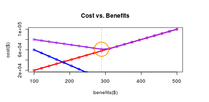
The different cost components are calculated below:

benefitsCostV <- input$numberee * benefits

attritionCostV <- input$salary * nTrainingMonths * input$numberee * (attrition / 100) totalCostV <- benefitsCostV + attritionCostV

And now we can plot the different cost components:

plot(benefitsCostV ~ benefits,col = “red”, main = “Cost vs. Benefits”, xlab = “benefits($)”, ylab = “cost($)”)

lines(benefits,benefitsCostV, col = “red”, lwd = 3)

points(benefits,attritionCostV, col = “blue”)

lines(benefits,attritionCostV, col = “blue”,lwd = 3)

points(benefits,totalCostV, col = “purple”)

lines(benefits,totalCostV, col = “purple”,lwd = 3)

Let’s find the minimal cost, and draw a nice orange circle around this optimal point:

minBenefitsIndex <- which.min(totalCostV)

minBenefits <- benefits[minBenefitsIndex]

minBenefitsCost <- totalCostV[minBenefitsIndex]

abline(v=minBenefits,col = “cyan”, lty = “dashed”, lwd = 1)

symbols(minBenefits,minBenefitsCost,circles=20, fg = “darkorange”, inches = FALSE, add=TRUE, lwd = 2)

Tip: Don’t spend too much time on writing the perfect R code; your model might change a lot once your stakeholders will provide their feedback.

Prototype

Shiny is web application framework for R that will turn your analyses into interactive web applications.

Let’s install Shiny and import the library functions:

install.packages(“shiny”)

library(shiny)

Once we have the model in place, we will create the user interface and link it back to the model.

Create a new file named ui.R with the User Interface (UI) elements.

For example, let’s write some text:

titlePanel(“Cost Optimization (Benefits and Talent) – Simulation”),

h5(“This interactive application simulates the impact of multiple …..

And let’s add a slider:

sliderInput(“numberee”,

“Number of Enployees:”,

min = 100,

max = 1000,

value = 200,

step = 100),

The inputId of the slider (numberee) is linking the value of the UI control (number of Employees) to the server side computation engine.

Create a Shiny account, copy-paste the token and a secret to the command line and execute in R-Studio:

shinyapps::setAccountInfo(name=’benefits’, token=’xxxx’, secret=’yyyy’)

And, deploy your code to the Shiny server:

deployApp()

Your prototype is live! http://benefits.shinyapps.io/BenefitsSimulation/

Send the URL to your stakeholders and collect their feedback. Iterate quickly and improve the model and the user interface.

Product

Once your stakeholders are happy with your prototype, it’s time to move on to the next stage and develop your data product.

The good news is that at this stage you should have a pretty good understanding of the requirements and the priorities, based on the feedback provided by your stakeholders.

It’s also the perfect time for you (or for your product development group) to focus more on hosting, architecture, design, the Software Development Life-cycle (SDLC), quality assurance, release management and more.

There are different technologies to consider when developing data products, which I will cover in future posts.

For now I will just mention an interesting option, where you can reuse your server-side R code. Using yhat you can expose your server-side R functionality via a set of web services, and consume these services from a client-side JavaScript libraries, like d3js.

Comments, questions?

Let me know.

Level up with Massive Open Online Courses (MOOC)

Last week I was attending the IDC FutureScape, an annual event where IDC, a leading market research, analysis and advisory firm, shared their top 10 decision imperatives for the 2015 CIO agenda.

The keynote speaker, Sandra Ng, Group Vice President at ICT Practice, went through the slides mentioning the newest technologies and keywords like Big Data and Analytics, Data Science, Internet of Things, Digital Transformation, IT as a service (ITaaS), Cyber Security, DevOps , Application Provisioning and more.

IDC Predictions

Eight years ago when I’ve completed my M.Sc in Computer Science, most of these technologies were either very new or didn’t exist at all. Since the IT landscape is evolving so fast, how can we keep up and stay relevant as IT professionals?

There is obviously the traditional way of registering for an instructor led training, be it PMP, Prince2, advanced .NET or Java, sitting in smaller groups for a couple of days, having a nice lunch and getting a colorful certificate.

But there are other options to access a world-class education.

A massive open online course (MOOC) is an online course aimed at unlimited participation and open access via the web. In addition to traditional course materials such as videos, readings, and problem sets, MOOCs provide interactive user forums that help build a community for students, professors, and teaching assistants (TAs).
http://en.wikipedia.org/wiki/Massive_open_online_course

Are you keen to learn more on how Google cracked house number identification in Street View, achieving more than 98% recognition rates on these blurry images?

StreetviewWhy don’t you join Stanford’s Andrew Ng and his online class of 100,000 students attending his famous Machine Learning course? I took this course two years ago, and this guy is awesome! So awesome that Baidu, the Chinese search engine, just hired him as a chief scientist to open a new artificial intelligence lab in Silicon Valley.

You can also join Stanford’s’ professors, Trevor Hastie and Robert Tibshirani, teaching Statistical Learning, using open source tools and a free version of the text book An Introduction to Statistical Learning, with Applications in R – yup, it’s all free!

There is a huge variety of online classes, from Science to Art to Technology, from top universities like Harvard, Berkeley, Yale and others – Google the name of the university plus “MOOC” and start your journey.

Level Up!